Editor’s Note: We’ve worked together with Brooklyn-based graphic designer Jeff Yas to create distinctive icons for all the cities we work in. We recently spoke with Jeff about the creative process behind creating these edible visuals, which we use to illustrate the “Cities” and “Culinary Walks” navigation on our homepage:
We may be biased, but we love the city icons you’ve created for CB! How do you go about distilling the culinary identity of a city into a single image?
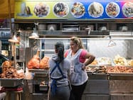
As a foodie, traveler and armchair anthropologist, creating these icons has been one of my all-time favorite design projects and I’m so grateful to be involved. It all starts on the ground: I listen to the knowledge that percolates up from the neighborhoods, through the tour guides, to the CB staff. This keeps our initial design conversations informed by up to date information, and rooted in CB’s wider ethos: to explore everyday but non-stereotypical aspects of local food traditions in a way that respects and sustains them. So we wanted to focus on food icons that make you feel like you are walking down the street.
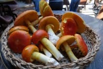
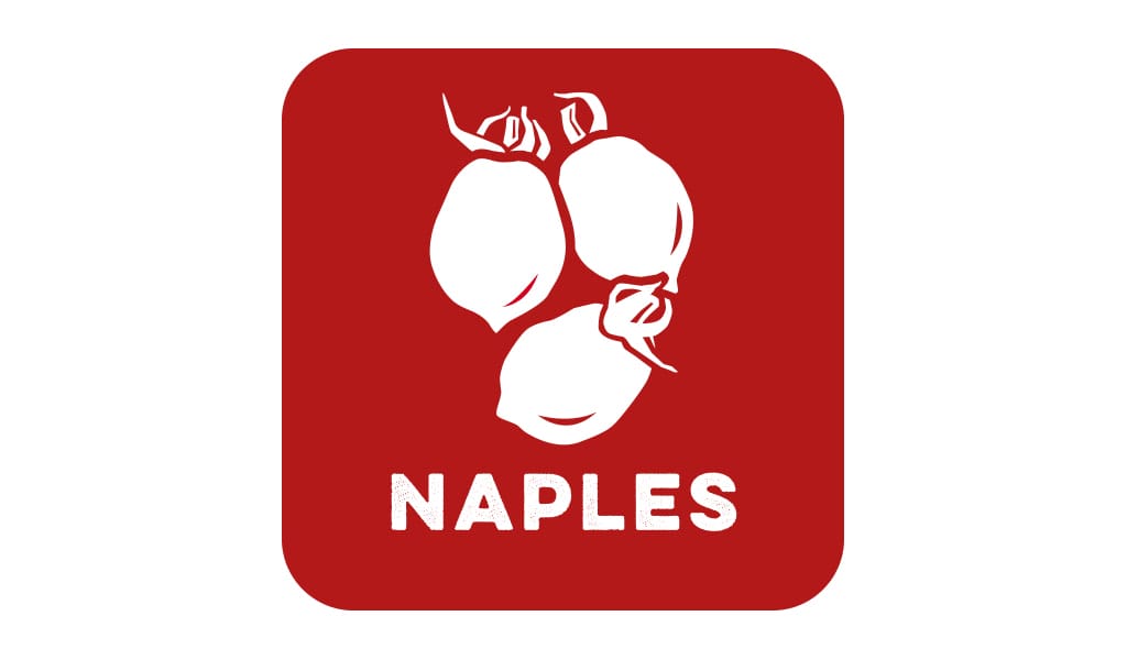
How did the Naples tomatoes icon evolve?
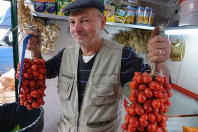 We were really looking at the cans of tomatoes that are famously exported from Naples, and where considering sort of an Andy Warhol can treatment. We then realized, however, that local residents would more often see these tomatoes in the market being sold on the vine. We also wanted to capture a bit of the unique shape of every tomato, while making people could recognize this strain as a local specialty.
Does “branding” a city’s culinary identity like this present any interesting challenges?
Very much so. What are the powerful images that every visitor from that place would recognize? How can we make a graphic that suggests the texture and life of local food culture? How can we make all of these icons look like they are in the same family, while keeping them unique and eye-catching, distinguished from mainstream travel iconography? These are the many challenges we embrace as a team as we set out to create each city icon.
Any favorites among the ones you’ve created? If so, why?
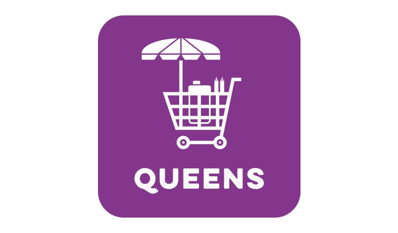
As a New Yorker, I love the new Queens shopping cart. I am so proud to live in a city where nearly 40% of the people were born in another country, and that little cart somehow embodies the international spirit being generously brought to our doorstep by hard working immigrant street vendors.


