Sign up with email

or

Already a member? Log in.

Trouble logging in?

Not a member? Sign up!

Join our upcoming

Food Tours!

Editor’s Note: We’ve worked together with Brooklyn-based graphic designer Jeff Yas to create distinctive icons for all the cities we work in. We recently spoke with Jeff about the creative process behind creating these edible visuals, which we use to illustrate the “Cities” and “Culinary Walks” navigation on our homepage:

We may be biased, but we love the city icons you’ve created for CB! How do you go about distilling the culinary identity of a city into a single image?

As a foodie, traveler and armchair anthropologist, creating these icons has been one of my all-time favorite design projects and I’m so grateful to be involved. It all starts on the ground: I listen to the knowledge that percolates up from the neighborhoods, through the tour guides, to the CB staff. This keeps our initial design conversations informed by up to date information, and rooted in CB’s wider ethos: to explore everyday but non-stereotypical aspects of local food traditions in a way that respects and sustains them. So we wanted to focus on food icons that make you feel like you are walking down the street.

How did the Naples tomatoes icon evolve?

We were really looking at the cans of tomatoes that are famously exported from Naples, and where considering sort of an Andy Warhol can treatment. We then realized, however, that local residents would more often see these tomatoes in the market being sold on the vine. We also wanted to capture a bit of the unique shape of every tomato, while making people could recognize this strain as a local specialty.

Does “branding” a city’s culinary identity like this present any interesting challenges?

Very much so. What are the powerful images that every visitor from that place would recognize? How can we make a graphic that suggests the texture and life of local food culture? How can we make all of these icons look like they are in the same family, while keeping them unique and eye-catching, distinguished from mainstream travel iconography? These are the many challenges we embrace as a team as we set out to create each city icon.

Any favorites among the ones you’ve created? If so, why?

As a New Yorker, I love the new Queens shopping cart. I am so proud to live in a city where nearly 40% of the people were born in another country, and that little cart somehow embodies the international spirit being generously brought to our doorstep by hard working immigrant street vendors.

Related stories

February 26, 2015

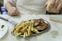
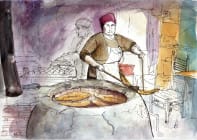
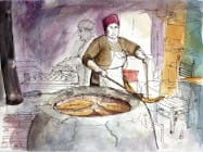
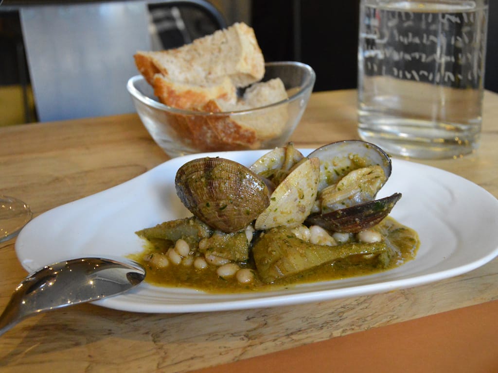
La Panxa del Bisbe: Mountain Man

Barcelona | By Paula Mourenza
BarcelonaHere we are in the Bishop’s Belly, La Panxa del Bisbe, which is not the midsection of a Catalan priest, but both a restaurant and a mountain. The latter is one of the peaks of the sacred Catalan mountain of Montserrat, so-called because its shape evokes a small head over a rotund, pronounced belly. It’s…
November 8, 2016

La Esquina del Chilaquil: Hangover Helper

Mexico City | By J. Alejandro
Mexico CityOn a Sunday morning in Mexico City’s Condesa neighborhood, the few people on the street mostly jog or bike or power walk. Trainers adorn their feet, spandex hugs their thighs, dogs tug their leashes. These paragons of fitness select exercise to combat their hangovers, a choice that reflects the aspirational character of the upper-middle-class neighborhood.…
September 25, 2023

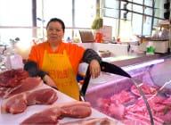
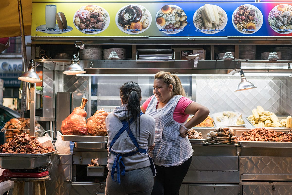
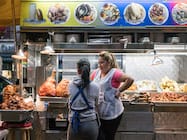
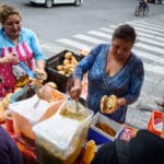
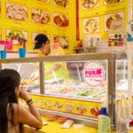
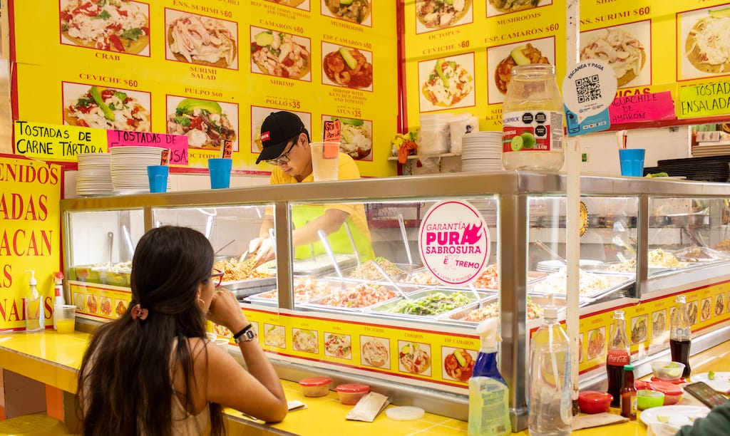
Tostadas Coyoacán: Disc Jockeys

Mexico City | By Cristina Alonso
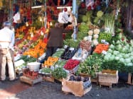
Mexico CityWalking among the stalls of Mercado Coyoacán is as exhilarating as it is slightly overwhelming: mountains of fresh fruit, rows of piñatas hanging from the ceiling, chocolate-covered scorpions, and mystical candles that promise to bring love and fortune all coexist in this sprawling space. The familiar phrase, “¿Qué va a llevar?” (What are you buying?)…
Select your currency
USD United States (US) dollar
EUR Euro